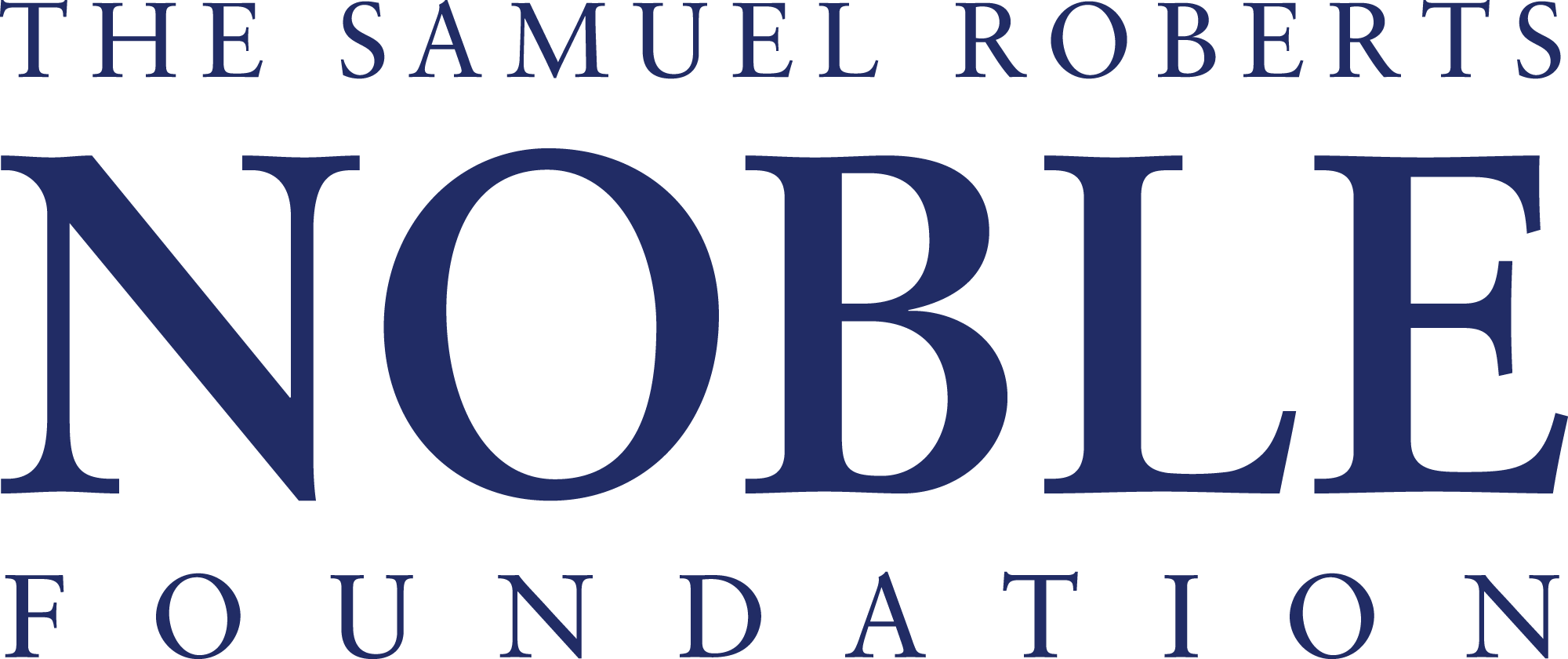
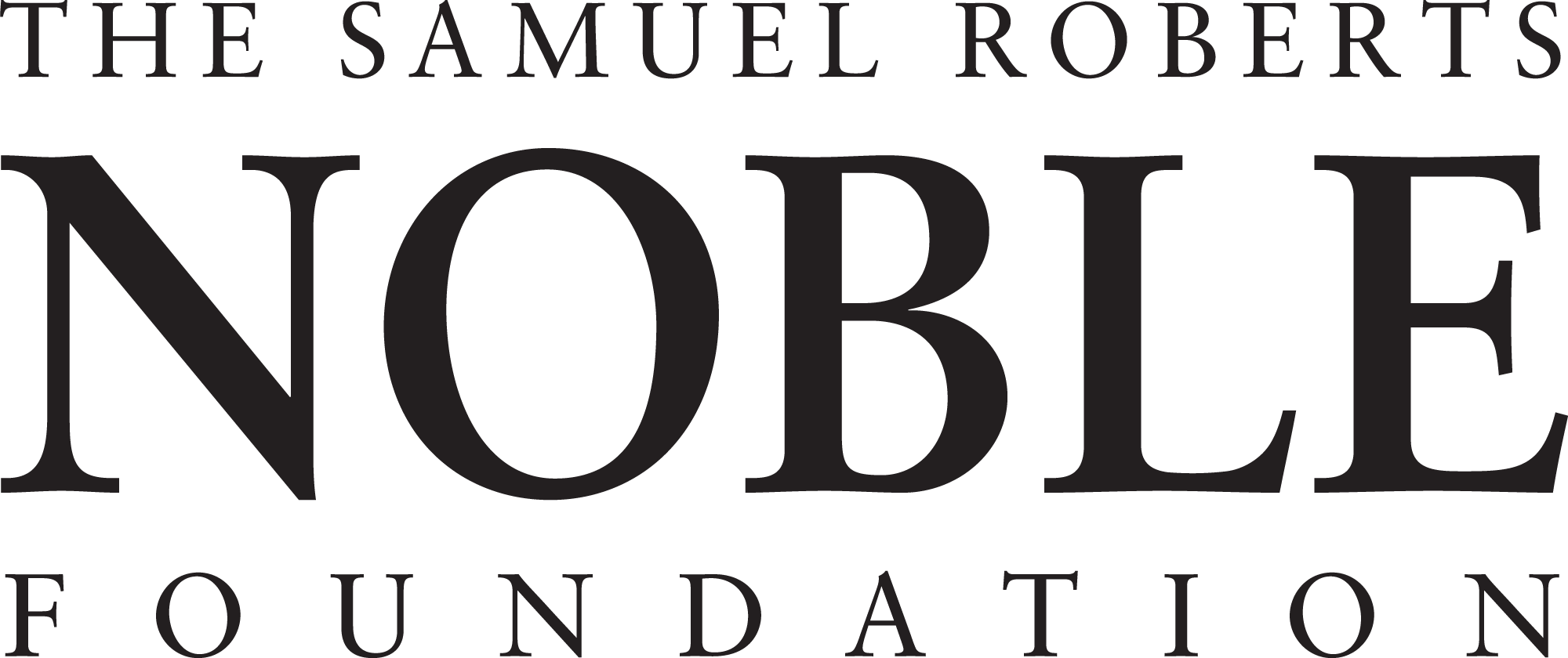
Logos and wordmarks of the Noble Foundation are important representations of the organization. To maintain their effectiveness, the marks must be used consistently and correctly.
Modifications
The Noble Foundation logo must be used in its full and complete form. This logo is collectively defined by its font, arrangement and coloration. The elements of the Noble Foundation logo may not be separated or omitted.
Sizing
Once the logo is placed and positioned in a document, slide or template, it can be sized as needed; however, the Noble Foundation logo must maintain its original proportions. To resize correctly, select the image. Hold down SHIFT. Move the mouse pointer over one of the corner handles and then click and drag the mouse. Release the mouse button before you release SHIFT.
Appropriate use:
Size the logo to fit your application; however, keep the logo’s original proportions.
Keep the logo large enough to be read when used.
Select the color that contrasts well with your application.
Start with the logos available for download from this page.
Do Not:
Recreate the logo.
Stretch, compress or distort the logo.
Download a logo below for a print publication.
Enlarge the logo until it becomes “grainy” or distorted.